I have noticed some candidates not utilizing the blog on their campaign web site. I understand you don’t have to blog, but it’s where your audience can comment and respond. A blog can help a candidate create a narrative post by post. A blog can also help merge all your campaign news into one spot so readers can find information easier. The campaign blog is also great gathering comments, having readers share the post with their friends and create a chronological narrative that expands your campaign’s media soundbites.
I’m not sure if blog is even a good word for what campaigns use a blog for. It sounds messy, but it’s not. A blog is a type of space where people can post in reverse chronological order. This format works well for updating the campaign web sites because it keeps readers interested in what the campaign is doing right now. Campaigns can organize the blogs into categories and the blog creates an automatic timeline for the campaign.
A campaign using social media should use all three of the popular social media outlets in this way: Facebook posts should create interaction, Twitter should be a campaign’s news feed, and a campaign’s blog should be used to expand the soundbite. All three can act together through the central campaign hub–the campaign web site. The beauty of all three working together is that all three allow for interaction in different ways.
Here’s how some candidates in this early campaign season are incorporating social media into their web sites:
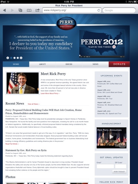
First, Governor Rick Perry is the newest GOP candidate to try for the most powerful job in America. Governor Rick Perry has a Twitter button and a Facebook button, but no blog. There’s nothing on this web site where people can become involved other than the Donate button. I know Perry is new to the campaign trail, but his campaign needs to step up and create a social media hub for their campaign. The main campaign web site is the place to create that social media hub. Potential voters may want to see more than just News, but they want everyday stories and happenings. I encourage Governor Perry to incorporate a blog with video, published campaign tweets, and lists of stories about events, speeches and volunteer efforts. Make the web site show the excitement of the campaign and entice viewers to become involved through participatory media.
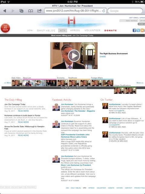
Jon Huntsman‘s campaign web site is very participatory. First, the web site is broken into three columns, one for current blog posts, one for Facebook posts, and one for his Twitter feed. His web site incorporates videos as well. The only thing he is missing is a mobile app for a phone and tablet. His web site reminds me a lot of President Obama’s because of the simplicity and openness of the design. I would suggest to Huntsman to go easy on the “building momentum” and “building steam” language. This rhetoric makes it seem as if you are behind. Every candidate needs to be confident. If candidates keep showing their events, highlighting supporters and volunteers then people will automatically assume through both visual and written rhetoric that the campaign is already “full steam ahead.” This type of proactive rhetoric will increase readers incentives to participate if they see likeminded others doing the same.
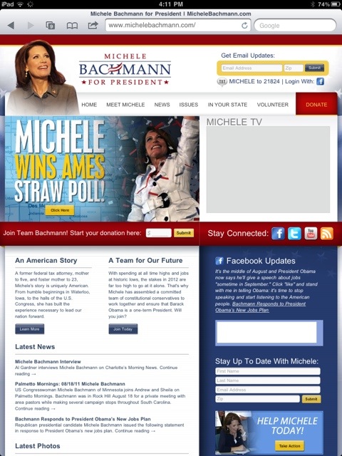
Michele Backhmann’s web site is, well, too complicated. I went there and maybe I clicked on the wrong link but it took me two clicks to get to the information. One sign in page is enough. First time visitors do not want to be frustrated before they get to the information they are looking for. Most potential voters do not want to register before they get to know the candidate. I suggest to give readers a chance to read about your political philosophy before inundating readers with two sign in pages or make it difficult to even find the home page. Bachmann’s campaign web site fails at design. The visual rhetoric feels cluttered and messy. Bachmann’s web site also fails at social media. She links to her Facebook posts, but again, people do not want to travel off a candidate’s web site. Moreover, Bachmann’s campaign needs to restructure their news page because it looks unorganized. One column is news and one column is press releases. The two columns look cluttered. To solve this problem–create a blog to chronologically keep track of press and news. Merge the two together and create a news powerhouse.
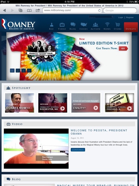
Next is Mitt Romney’s campaign web site, which is the standard campaign blue, has his opponent’s picture on the front. I am not sure if I would agree with putting the President’s picture on his highlight banner with Nancy Pelosi and Joe Biden, but I’ll go with it. I also notice the R is very Obamaesque of his 2012 logo that captures the red, white and blue waves. I do like how Romney has a blog and a news link separately, but I am wavering on how Romney’s campaign blog is four squares and then makes me click to read more of the story. The blog posts do not give me enough information at first glance. I like how Romney has learned from Obama’s campaign by creating an “Action” button. Readers can click here if they are interested in volunteering, creating a fundraising page, donating, or wanting to purchase campaign gear. Action is a very good word to use that promotes participation. I clicked on it just out of curiosity.
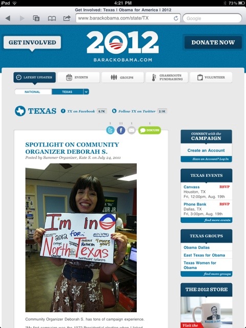
President Barack Obama’s web site is simplistic. Their campaign did a good job making it feel Web 2.0 and beyond. The blog acts as the main news center. In fact, when you visit BarackObama.com, you automatically are sent to the blogroll–nice. Why get anymore complicated than that? The other neat addition is the National version of the blog or your state’s version. The blog will highlight national campaign news, but when you switch to your state, the blog roll changes to news about events and volunteers in your region. The participatory nature is nice and the web site is not complicated. I assume this simplicity is used because he’s the incumbent and background information is not needed as much as the GOP hopefuls.
Why Social Media is Important to a Campaign
If candidates want to change their web sites then they need to do that now. John McCain waited too late to make his campaign web site in March 2008 more participatory. But, his blog was unattainable from October 2008 to Election day. A month before election day is not the day a candidate should shut down their campaign blog. Unfortunately, Senator McCain did not update his blog that often, which is not acceptable for a candidate campaigning during the height of social and mobile media. All candidates need to start incorporating social media more into their every day campaign activities. Mobile media is important as well. All of the candidates need to take the digital venue as seriously as they do town hall meetings and other speeches.
The Pew Internet and American Life Project reports that a third of American adults own a smartphone. These smartphone users are downloading apps and checking Facebook and Twitter. This means more messages from your campaign could be sent through these electronic outlets. Candidates need to take advantage of expanding their soundbites. The press can spin a story, but a candidate can create their own media outlet that shares the story on why they said what they did and put a misquote into a logical quote. Remember, a soundbite is rhetorical only to the media outlet producing the story. The soundbite has no logical reasoning, no emotional appeal nor does it represent the true ethos of a candidate. A soundbite is usually used for information only, but media outlets are not as unbiased and as ethically sound as they were 30 years ago. The campaign can create all the appeals by documenting and showing every speech made in every city and making sure their soundbites are not just soundbites anymore.
A campaign’s website equipped with social media can help create a relationship between candidate and electorate that goes beyond the outdated soundbite. Now the American citizen has the capability to dialogically interact with the campaign, which then creates more citizens moved to action. Social media creates a citizen-centric campaign that is beyond what President George Washington could have imagined when he just stood for election in 1788–but I imagine President Washington would be excited to achieve a rhetorical social media campaign where citizen’s voices mattered.



6 comments On Campaign 2012–Incorporating Social Media in a Campaign Web site–Hits and Misses
Great post. The other candidates should take some advice from Obama and set up simpler websites. I personally like to be able to go to a website and find their platform and where they stand on issues. I would love a very simplistic Pro-choice, Supports tax reform, Supports a Balanced Budget, etc.
Thanks Theresa! I really like simplistic. I think some candidates take their rhetoric too far and make it confusing. Simplicity in a message in a social media world is the best way for candidates to share their messages. People do not have time to examine web sites, they move on if they get too complicated like Bachmann’s does. Obama streamlines his messages and really it acts like a Facebook page does… a newsfeed but it expands his messages, post by post. You can skim and scroll. I highly recommend all candidates take a simplistic approach to their campaign web site and allow Facebook and Twitter to merge into the bigger message. I think they need to allow the blog to tell their story rather than have 5 pages on a web site explaining who they are. Have one about me, a blog, a where I stand on issues, and then allow Facebook, twitter and the blog to do the work.
Very interesting article. I agree about how complicated websites can increase your bounce rate hence defeating the purpose. “Social Mob Mentality” can be seen from the activity after the earthquake in Virginia. Within minutes the chatter just from my friends was tremendous. Within 20 mins there was a profile page titled Earthquake survivors page. The likes increased by the second. Within no more than 10 minutes people were sending out pics of chairs that fell over and product that fell off the shelves. Even I joined the mob to put my 2 cents in.
Politicians need to feed that mob mentality to generate website excitement which propels their campaign. Obama used that method in his first election. Its no longer a matter of who shakes the most hands and gives be most speeches.
Just sayin……….
Just forwarded this link to the Perry campaign. Let’s hope they get smart and listen to your expertise!
I have especially been interested in Ron Paul’s website. It looks excellent.
His mobile app is nice as well.